Your cart is empty


Küche


PROFESSIONAL 3D NOBILIA KITCHEN PLANNER - Desktop


TWO KITCHEN PLANNERS - ONE GOAL: YOUR PERFECT KITCHEN
Choose the right online kitchen configurator now
← Left for maximum planning freedom - Free & professional kitchen studio planning for DIY enthusiasts
→ Right for quick and easy kitchen planning on your smartphone or tablet
DIRECT KITCHEN PLANNING WITH PRICES
With our two innovative online kitchen configurators, you can plan a high-quality nobilia kitchen with nobilia kitchen cabinets & optional appliances. Both TOP-SHELF.de 3D online kitchen planners are very fast, easy to use, completely free, and immediately show you our transparent prices!
INTUITIVE & FAST KITCHEN PLANNING - On all devices


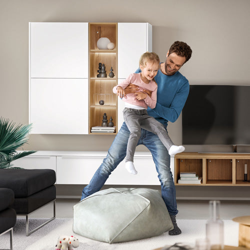
Courage for color: How to design your kitchen stylishly and timelessly
The color selection is a central tool to define the character of a kitchen. While white was long considered the standard, the trend is moving towards more individual and homely concepts. A successful color design is based not only on the choice of a color tone but on the understanding of the interplay of color, material, surface, and light. This guide analyzes common color concepts and highlights the technical aspects that are crucial for a durable and satisfactory design.
1. Basic Color Concepts in the Dream Kitchen
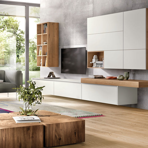
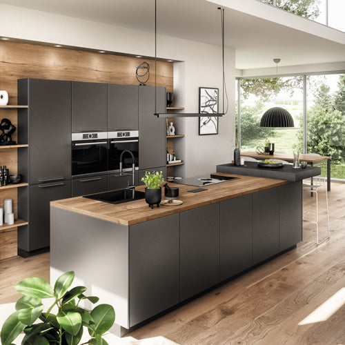
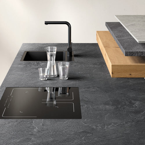
Gray tones: Gray serves as a versatile and timeless base. The effect varies significantly depending on the shade. Light gray tones appear subtle and visually enlarge spaces. Warm gray tones with brown or beige components (greige, taupe) create a cozy atmosphere. Dark tones like anthracite or graphite give a kitchen depth and an architectural character. The effect is strongly influenced by the surface: an ultra-matte gray front absorbs light and appears very calm, while a high-gloss gray front appears lively and deep due to reflections.
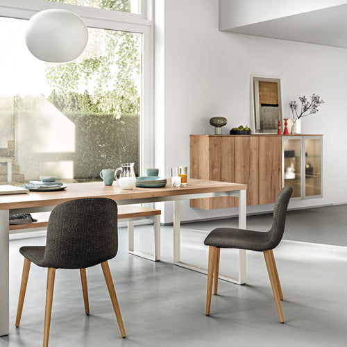
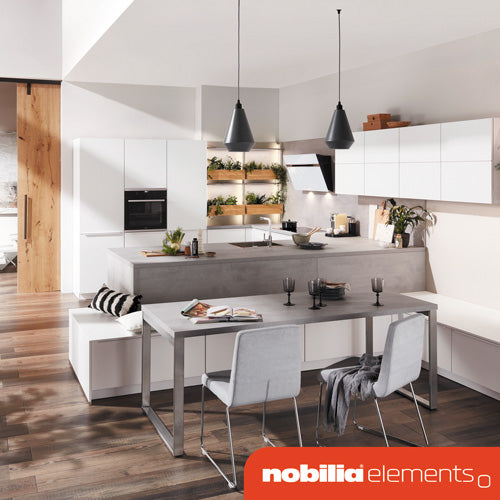
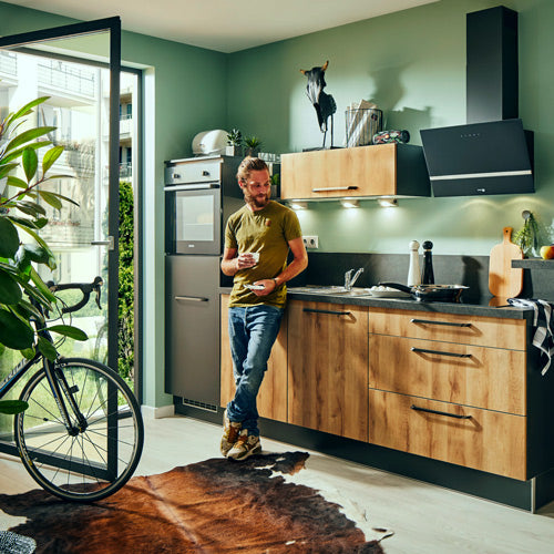
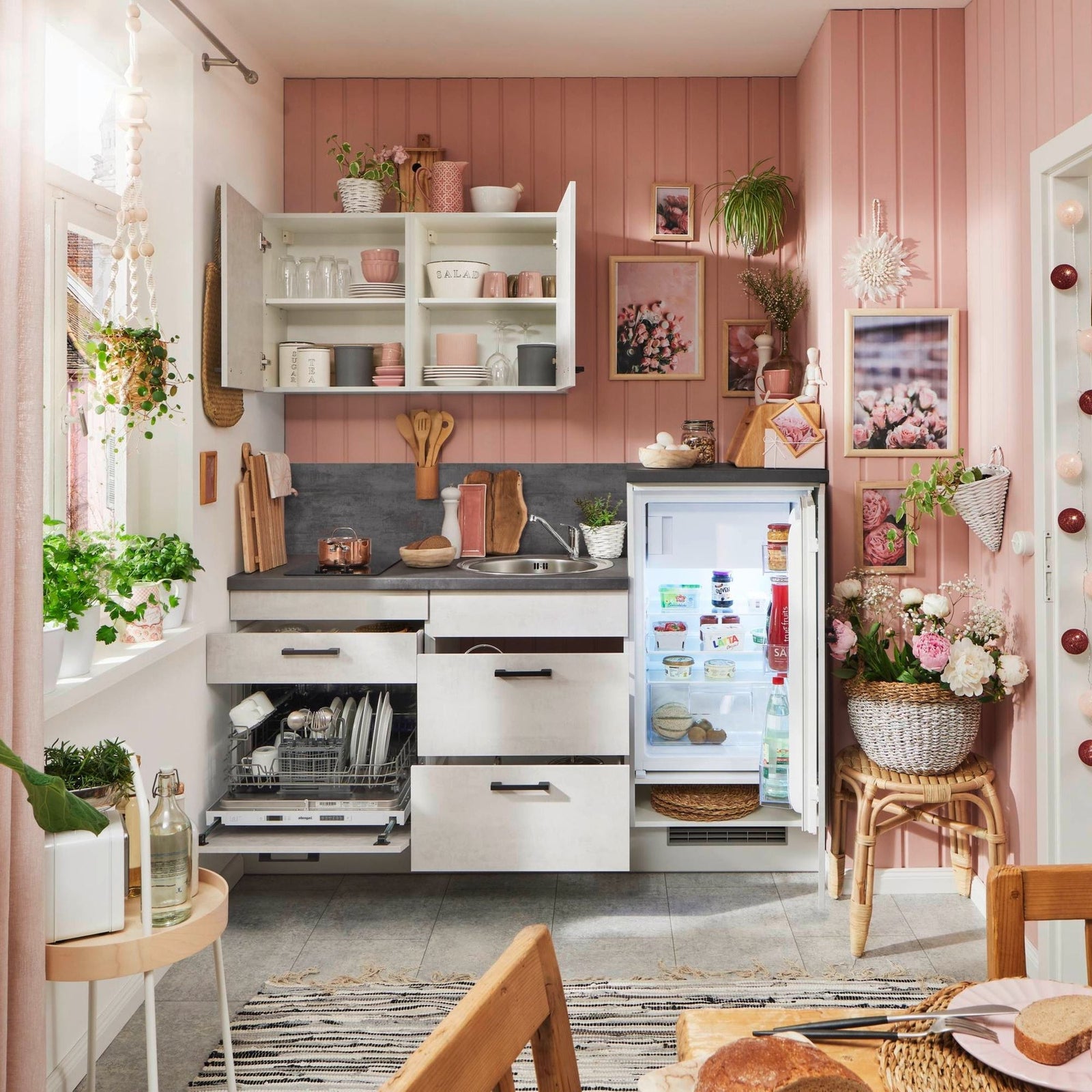
Natural tones: Earthy, nature-inspired colors like sand, beige, reed green, or terracotta create a calm, harmonious ambiance. These colors unfold their effect best on matte surfaces that gently diffuse light and emphasize the natural appearance. The combination with materials such as wood or stone enhances this effect.

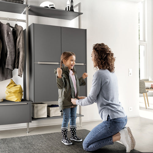
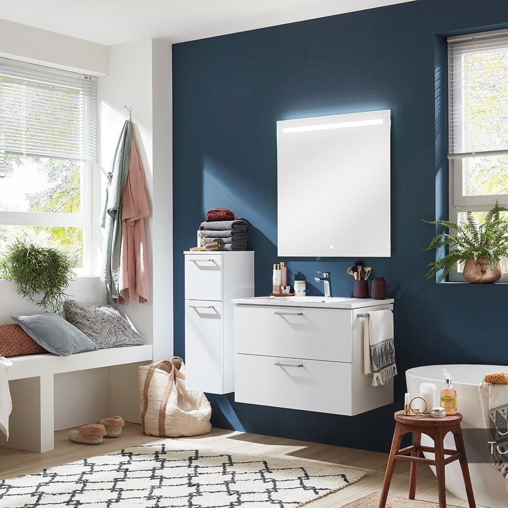
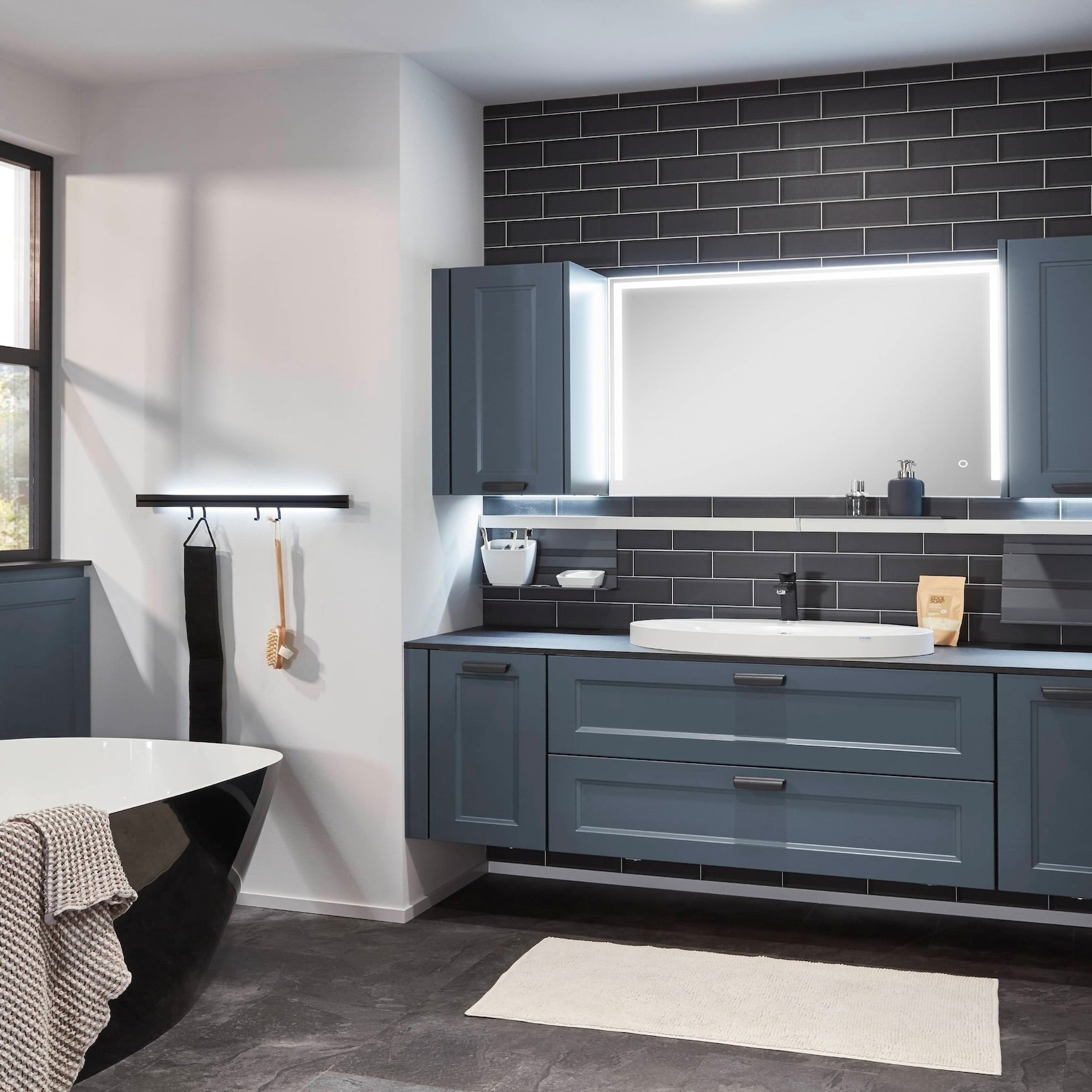
Dark color worlds: Kitchens in colors like black, dark blue, or forest green create a valuable and elegant spatial effect. However, they absorb a lot of light and can visually reduce spaces. Their use is therefore especially recommended in spacious, well-lit rooms or in combination with a professional, multi-level lighting concept. Contrasting elements, such as a countertop made of light wood or metallic accents, are often necessary to create visual tension.

Accent colors (using green as an example): Muted tones are suitable for a distinctive color scheme. Green, as a natural color, has a balancing effect. Soft, grayish tones like sage are versatile to combine. Rich, dark greens create a cozy, intense atmosphere. Green harmonizes well with light wood, black accents (handles, fittings) for a graphic note, or brass for a high-quality contrast.

2. Combining Color and Material
The effect of a color is inseparably linked to the carrier material and its surface texture.
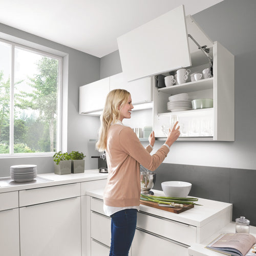
Painted fronts: Offer the greatest color variety. They can be painted in any desired color tone according to standardized systems such as RAL or NCS. This allows precise coordination with other elements in the room. The surface can range from ultra-matte to high-gloss, which strongly influences color perception. Matte surfaces diffuse light and appear calm but are more prone to fingerprints. High-gloss surfaces reflect strongly and create depth but can also appear more restless.
Laminate and veneer: Here, the color selection is limited to the manufacturers' collections. These materials offer high resistance and are easy to maintain. The surfaces often have a fine texture, which influences the tactile feel and can reduce sensitivity to fingerprints.
Glass fronts: The color is achieved by a rear-side painting of the glass. The smooth, glossy glass surface creates a special color brilliance and depth. Cleaning is easy, but fingerprints are clearly visible.
3. Technical Aspects of Color Quality
Color systems (RAL/NCS): The use of standardized color systems is a quality feature in kitchen planning. It enables precise, cross-manufacturer communication of the desired color tone and ensures that individual parts or fronts can be reordered in exactly the same color tone even after years.
Lightfastness: Refers to the resistance of a color to fading caused by UV radiation. High-quality paints and materials have high lightfastness, which is especially important in sun-exposed kitchens to ensure long-lasting color stability. Information on this can often be found in the manufacturers' technical data sheets.
4. Planning Strategies for Kitchen Colors

Color distribution: A complete design in a dominant color is just one of many possibilities.
- Two-color concepts: A common method is the combination of colored base cabinets with neutral upper cabinets (e.g., in white or light gray). This grounds the kitchen visually while the upper area remains light and open.
-
Accentuation: A single wall, the niche backsplash, or a kitchen island in a contrasting color can serve as a targeted eye-catcher without dominating the room.
Special case: Small or dark rooms:
- Light, cool colors on the walls and for the upper cabinets make the room appear larger.
- Glossy surfaces can create more brightness and depth through light reflections than matte ones.
- A light countertop reflects light and brightens the work area.
- A vertical two-tone (dark base cabinets, light upper cabinets) can visually stretch the room height.
5. Conclusion and Guiding Questions for Planning
Color is a powerful tool for individual kitchen design. A well-founded decision is based on examining color samples under the real lighting conditions of one's own room. The following questions can help in planning:
- Atmosphere: What mood should the kitchen convey (e.g., calm, stimulating, elegant, cozy)?
- Lighting conditions: How is the natural light in the room and how does it change throughout the day? How does artificial light affect the color in the evening?
- Room context: Which adjacent rooms, floor materials, and wall colors must be considered in the color concept to create a harmonious overall picture?
- Material and surface: Which surface texture (matte, glossy, textured) fits the desired style and expected use? How important is resistance to fingerprints?
- Longevity: Is the chosen color tone a timeless decision that will still be liked in several years, or a fashionable choice whose replacement should be planned?
View full article


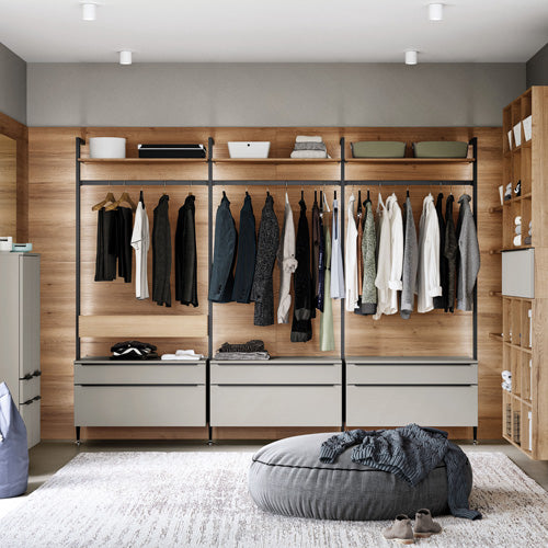
Qualität und Funktionalität der nBOX von nobilia
Viele Eigentümer suchen in Küche, Bad und Wohnbereich mehr Stauraum bei verlässlicher Qualität. Die nBOX von nobilia ist ein modulares Schubkastensystem mit geprüfter Materialqualität, hoher Belastbarkeit und optionaler Push to open Funktion. Basierend auf nobilias Prüfstandards und Emissionsnachweisen finden sich praxisnahe Planungs und Nutzungstipps für langlebige nBOX Lösungen.
View full article

Qualitätsmanagement bei nobilia: Prozesse, Prüfungen und Standards
Qualitätsmanagement entscheidet über Lebensdauer und Werterhalt von nobilia Küchen. ISO-Zertifikate, Labortests und Prüfverfahren belegen nobilia Qualität und made in germany Standards. Sie erhalten klare Kriterien zur Bewertung von nobilia Küchen und praxisnahe Hinweise für Montage und Alltagstauglichkeit.
View full article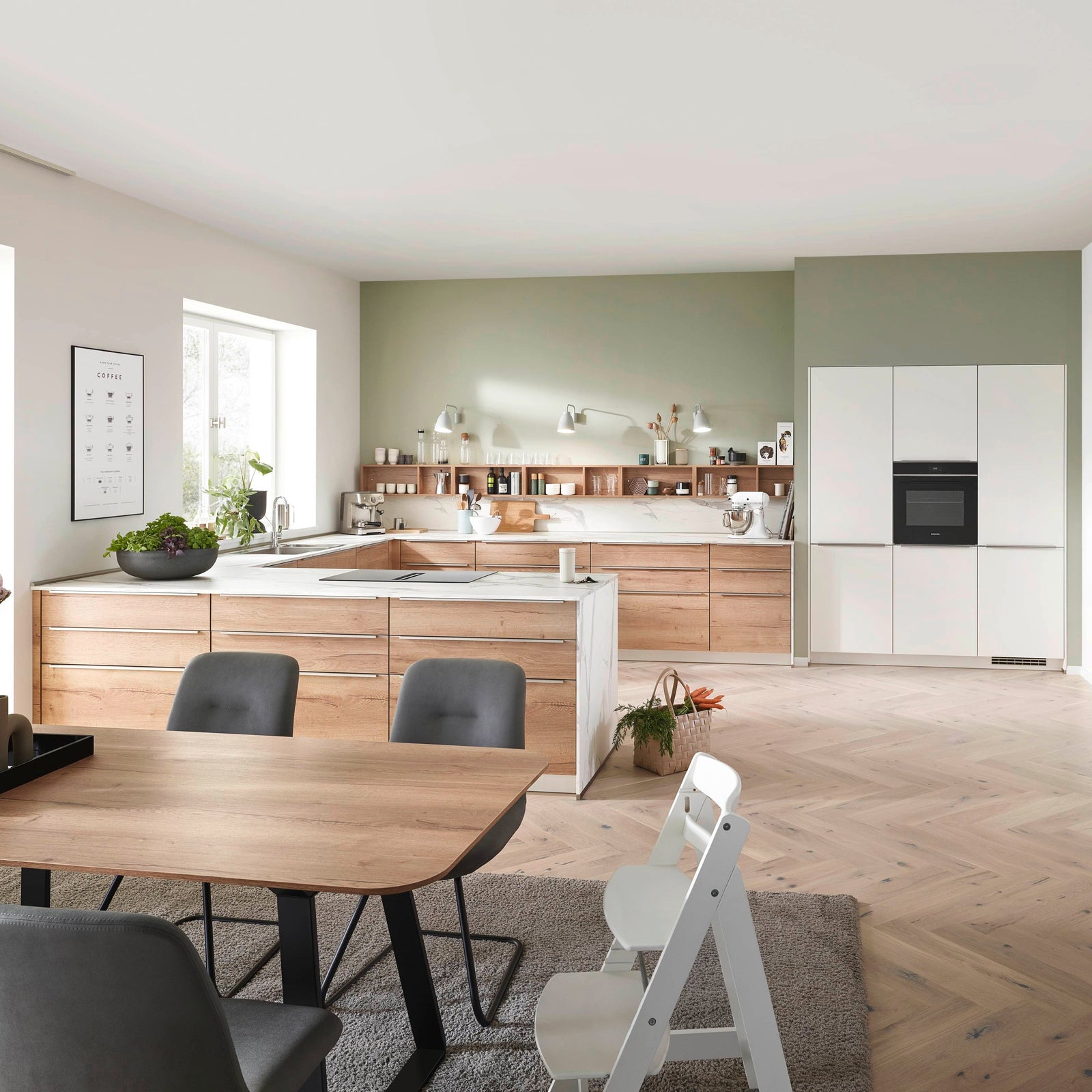

Sachliche Küchenplanung für erfahrene Käufer
Erfahrene Käufer wissen: Sachliche Küchenplanung spart langfristig Zeit und Kosten. Faire Angebotsküchen und gebrauchte Ausstellungsküchen im Küchenstudio bieten hohes Potenzial, wenn Sie drei zentrale Planungsprinzipien beachten. So erreichen Sie robuste Materialien, ausreichenden Stauraum und ein klares Raumkonzept.
View full article

Qualitätsmerkmale von nobilia Möbeln: Fachliche Orientierung für Planung und Nutzung
Die Planung von Küche oder Bad scheitert oft an unklaren Qualitätsmerkmalen von Korpus und Schrank. Standardisierte Fertigungsprozesse und technische Merkmale zeigen, worauf es bei Korpuskonstruktion und Materialwahl ankommt. Klare Hinweise zu Belastbarkeit, Scharnieren, Feuchteschutz und Montage erleichtern die sichere Planung und Nutzung von Küchenkorpus und Möbeln.
View full article

Qualitätsmerkmale moderner Küchenmöbel: Fachliche Orientierung für nobilia Planungen
Unsicherheit bei der Küchenplanung? Moderne Küchenmöbel von nobilia vereinen technische Belastbarkeit, Materialqualität und präzise Montage. Als Küchenexperten bieten wir praxisnahe Orientierung zu Qualitätsmerkmalen und zeigen, worauf Sie für eine langlebige Traumküche achten müssen.
View full article

Wertbeständige Möbel: Konstruktive Qualität sachlich bewertet
Wer eine moderne Küche plant, braucht langlebige Möbel mit solider Konstruktion und hochwertiger Ausstattung. In dieser Übersicht analysiere ich die Korpusstärke, Frontmaterialien und Anti-Fingerprint-Oberflächen von nobilia-Küchen im Detail. So erkennen Sie die entscheidenden Qualitätsunterschiede bei Küchenfronten, Korpusaufbau und Oberflächenbeschichtung.
View full article Qualität und Funktionalität der nBOX von nobilia
Viele Eigentümer suchen in Küche, Bad und Wohnbereich mehr Stauraum bei verlässlicher Qualität. Die nBOX von nobilia ist ein modulares Schubkastensystem mit geprüfter Materialqualität, hoher Belastbarkeit und optionaler Push to open Funktion. Basierend auf nobilias Prüfstandards und Emissionsnachweisen finden sich praxisnahe Planungs und Nutzungstipps für langlebige nBOX Lösungen.
View full article Qualitätsmanagement bei nobilia: Prozesse, Prüfungen und Standards
Qualitätsmanagement entscheidet über Lebensdauer und Werterhalt von nobilia Küchen. ISO-Zertifikate, Labortests und Prüfverfahren belegen nobilia Qualität und made in germany Standards. Sie erhalten klare Kriterien zur Bewertung von nobilia Küchen und praxisnahe Hinweise für Montage und Alltagstauglichkeit.
View full article Sachliche Küchenplanung für erfahrene Käufer
Erfahrene Käufer wissen: Sachliche Küchenplanung spart langfristig Zeit und Kosten. Faire Angebotsküchen und gebrauchte Ausstellungsküchen im Küchenstudio bieten hohes Potenzial, wenn Sie drei zentrale Planungsprinzipien beachten. So erreichen Sie robuste Materialien, ausreichenden Stauraum und ein klares Raumkonzept.
View full article